They finally did it. After more than 230 years in circulation, the U.S. penny is being retired.
First minted in 1793, the penny was once essential to daily life — a stamp, a meal, a favor. But times change. Inflation did its thing. And eventually, the cost to produce one penny rose to over four cents. It stuck around more out of habit than utility, until someone finally asked,
“IS THIS STILL WORTH IT?”
That question feels familiar.
If you’ve been running trade show programs for a while, chances are you’ve held onto a few pennies of your own: systems, displays, or habits that once made sense but no longer do. And just like the coin, they might be costing you more than they’re worth.
With the penny finally on its way out, this seems like a good time to ask:
WHAT ARE YOU STILL CARRYING AROUND AND WHY?
A Penny Saved is a Penny Earned
We talk about ROI all the time in this business, but sometimes the smartest return comes from what you don’t spend.
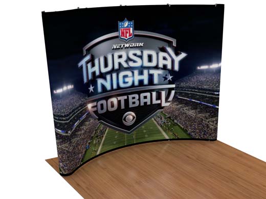
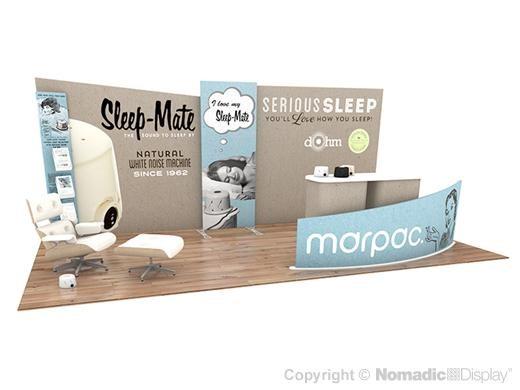
Take graphics, for example. I’ve seen plenty of clients breathe new life into their exhibit just by refreshing their visuals. New branding, new campaign, new story — all while keeping the same system. If your structure is still in great shape, why rebuild it?
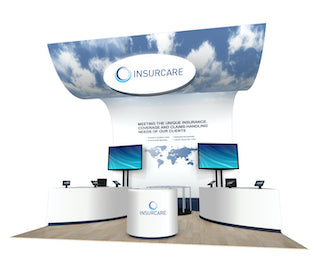
That’s the beauty of scalable systems like Instand, DesignLine, and SPlus. They’re built to grow, shift, and evolve with your needs. You get longevity and flexibility. And right now, for a limited time, you can save 10% on select display solutions — because smart strategy should come with smart savings.
Rentals offer the same smart savings. If you're not using a display often or you need something different for a big show, why not rent? Today’s rentals are miles away from the cookie-cutter setups of the past. You can get a fully custom look, built to your specs, without the long-term costs of storage, maintenance, or refurbishment.
Saving smart isn’t about cutting corners, it’s about spending with purpose.

Penny Wise, Pound Foolish
It happens. A team cuts the wrong corner thinking it’ll save time or budget, but ends up paying more in the long run.
I’ve watched companies ship oversized custom booths across the country for one-day shows when a local rental would have cost half as much. I’ve seen beautiful new displays get overlooked because the staff didn’t know how to engage or qualify leads. I’ve even seen companies skip lighting and interactive technology, then wonder why their high-end graphics fell flat under the venue’s ceiling cans.
You can’t prevent every surprise, but you can design around known pitfalls. Portable modular exhibits cut down on shipping and storage. Local rentals solve last-minute spacing issues. Pre-show training prevents awkward booth silences.
Being budget-conscious is smart. But cutting the wrong things? That’s where the real waste lives.
Not Worth a Penny
We all have legacy items — physical or strategic — that stick around out of routine more than reason.
That set of outdated brochures. That clunky interactive screen no one uses anymore. The messaging you meant to update two seasons ago. If it’s not helping you attract, engage, or close, then what exactly is it doing?
Effective trade show strategy isn’t just about what you bring, it’s about what earns its spot. A high-traffic layout, updated graphics, flexible configurations, and a focused staff can outperform expensive “wow” pieces that don’t connect with attendees.
Does your exhibit invite people in or just take up space?
Does your story unfold clearly, no matter where someone enters?
Is your display helping you sell, or just helping you show up?
Sometimes it’s not about what you add. It’s about what you stop dragging from show to show.
In for a Penny, In for a Pound
Once you’ve booked the space and paid for the team, you’re in. So go all in — strategically.
That means every element of your exhibit should support a goal.
- Are you launching a product?
- Targeting a new segment?
- Reinforcing brand awareness?
- Booking meetings?
Your display should reflect that. Not just in how it looks, but how it functions.
MODULAR SYSTEMS SHINE HERE. They let you start small, test layouts, reconfigure as you grow, and adapt to different show requirements. You can build on what’s working and retire what’s not — without reinventing your footprint every season.
Trade shows are expensive. But the most costly decision of all? Phoning it in with no plan.
A Penny for Your Thoughts
ENGAGEMENT MATTERS. Because no matter how beautiful your exhibit is, if people don’t interact, it’s just furniture.
Design should do more than stand out, it should invite people in. That means building in experiences. Touchpoints. Demos. Conversations. Some of the most effective exhibits I’ve seen weren’t flashy. They were smart. Comfortable space for meetings. Tactile product displays. Staff who knew how to qualify a lead without sounding like a script.
Want people to stay longer?
Give them something to do.
Want them to understand your brand faster?
Tell your story from every angle and not just one front panel.
Want better conversion after the show?
Make sure the person collecting leads knows what to ask, how to categorize them, and where that data’s going next.
An exhibit should never rely on someone walking all the way around it. Assume they’ll enter from one side, talk to one rep, and leave. Build your layout around that behavior, not ideal-world traffic.
 Every Penny Counts
You don’t need a giant footprint to make a strong impression. I’ve seen 10x10 spaces outperform 20x20 islands just by being better focused, better staffed, and better designed.
With the right system, you can adapt your setup to different shows without compromising quality. You can add height, storage, interactivity, and even backlighting, all in a space that packs into a few lightweight cases.
Consistency is key. When your message, visuals, and experience all align — no matter the show size — you build momentum. People remember you. They come back. They refer others.
That’s the kind of compounding return that makes every penny count.
Pick Up a Penny?
You’ve probably heard the saying:
“Find a penny, pick it up…”
But not every penny is lucky, especially on the show floor.
In trade show programs, it’s often the little things that slip through unnoticed. The flooring that’s been through one too many installs. Lighting that washes everything out. That stack of brochures no one grabs yet still gets reprinted every year. These elements feel small, but over time, they eat into budget, drag down engagement, and clutter your strategy.
Now flip that: the small upgrades that do get noticed like soft flooring that encourages people to linger, lighting that enhances your messaging, or a simple display element that invites interaction. These details don’t just look better. They perform better.
When budgets are tight, the temptation is to leave the “small stuff” alone. But the compounding effect of outdated or underperforming elements adds up faster than you think. One penny? Fine. Fifty of them weighing down your crate? Not so great.
A smart exhibit isn’t just modular in structure. IT’S MODULAR IN MINDSET. If it’s not helping you attract, engage, or convert — maybe it’s time to leave that penny on the ground.
 A Nickel for Your Thoughts
Change in the trade show world rarely comes in one big move. It’s often dozens of small decisions that add up over time and not always in your favor.
The penny’s exit is more than a headline. It’s a reminder to check your assumptions. What are you still paying for — in time, money, or energy — that no longer delivers?
Maybe it’s your layout. Maybe it’s your follow-up process. Maybe it’s a display that hasn’t been updated since your last logo redesign.
Whatever it is, you don’t need to scrap everything. You just need to start asking different questions.
Which parts of your exhibit still hold value?
Which ones are costing you more than they return?
And what’s your next smart move?
If you’re ready to make a change — even a small one — we’d love to help.